I love Asana. As far as project management goes, it is great. We find it simple to use and meets our needs as a small business. However, the styling leaves a lot to be desired. Many of the features we do not use and would love to hide, as the sidebar can get cluttered. We also wish there were different colors to help things stand out more.
Hiding the Team Calendar, Reports, My Favorites & Changing Colors in Asana
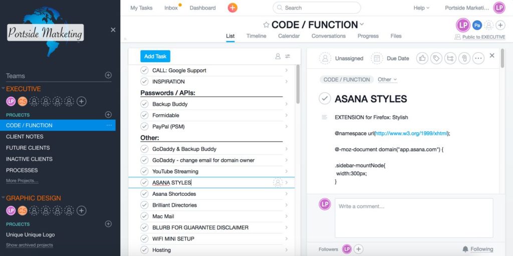
My friend Chris is a genius. He shared with me a handy little tip on how you can hide the team calendar in Asana. Or how to hide the reports or my favorites in Asana. Heck, he even showed me how to make the changes to colors and such so the sidebars are easier to read. Here is how my Asana now looks:
 Note the following items are no longer showing:
- Team Calendar
- Team Conversations
- My Favorites
- Reports
Also note how we use our own logo, which is great for our brand and culture. And, the colors for each project (orange) help them stand out. So how do we do all of this?
Using Stylish to Change the Appearance of Asana
My friend Chris introduced me to Stylish. It is an add-on for Firefox (it works in other browsers as well) and allows me to change the CSS for any site, so I can see it how I prefer. WOW!
Here is what I changed my CSS to do:
@-moz-document domain(“app.asana.com”) {
.sidebar-mountNode{width:300px;}
.bar-row .bar_input_span {font-family: arial; padding-bottom: 4px; margin-top: 26px;}
.gridPaneView:not(.short-tasks) .bar-row .gridCell-singleRowContainer {height: 60px;}
.grid-row-selected .grid_cell_item_number {margin-top: 24px;}
.task-row.grid-row-selected .itemRowView-detailsButton, .grid-row-selected.grid_pseudorow_no_prioritized .itemRowView-detailsButton {
color: #E01829;
fill: #EF092D;
padding-left: 8px;
}
.itemRowView-detailsButton {
color: #E01829;
fill: #EF092D;
padding-left: 8px;
}
.task-row.grid-row-selected:not(.focused):not(:hover) .itemRowView-detailsButton:not(:hover) {
color: #E01829;
fill: #EF092D;
padding-left: 8px;
}
.navigationDockItemView-label {color: #D0D0D0;font-size: 14px;}
.react-mount-node .SidebarTeamDetailsProjectsList-header {color: #58bfbe;}
.react-mount-node .SidebarTeamMembership.is-expanded .SidebarTeamMembershipHeader-teamName, .react-mount-node .SidebarTeamMembershipHeader:hover .SidebarTeamMembershipHeader-teamName{
color: #ff6600 !important;
}
.teamConversation{color:azure;}
.react-mount-node .SidebarHeader-asanaLogo {
background-image: url(“https://www.portsidemarketing.com/wp-content/uploads/Posrtside_Marketing_Logo_No_Tagline2.png”) !important;
height:150px;
background-size: 200px;
}
/* This hides “Team Conversations” and “Team Calendar” */
div.SidebarTeamMembersList ~ a.SidebarItemRow{display: none;}
.team-calendar-link, .Team Calendar{display: none;}
.SidebarRecentsAndFavorites–withoutClarifiedNavigation,.SidebarReports–withoutClarifiedNavigation{
display: none;}
}
That small bit of code makes our daily work life so much easier!
How to Install Stylish Add-on for Firefox
Visit the Stylish website for information and how-to instructions on installing for your browser:
https://userstyles.org/
They also have many schemes for Asana:
https://userstyles.org/styles/browse/asana
Then visit my friend Chris Ulrich on Stylish to see his code as well:
https://userstyles.org/styles/140015/chris-asana


